
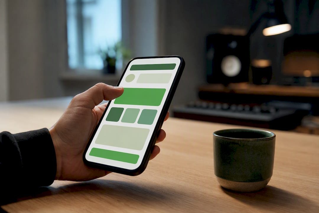
A tip page is a single link where anyone can send you money in seconds, no account required on their end. You can build one and go live in under 10 minutes with a personalized link, three preset amounts, and Apple Pay or Google Pay turned on. The rest of this guide shows exactly what that page should say and look like, with copy-ready examples for every kind of creator.
TL;DR:
- Wallet payments like Apple Pay and Google Pay significantly enhance conversion rates due to their one-tap confirmation, especially on mobile devices.
- Using three well-chosen preset amounts and keeping the tipping process within three taps minimizes friction and boosts the likelihood of tips.
- Placement of tip links matters; ideal spots include bios, email signatures, website footers, podcast shownotes, and printed materials with QR codes.
- Testing the entire payment flow on different devices and conditions is crucial to ensure a smooth, trustworthy experience before going live.
- Prioritizing the simplicity and speed of the payment process results in higher tips than focusing solely on visual design or offering many options.
Table of Contents
- What Is a Tip Page and Why Do Creators Use One?
- Concrete Tip Page Examples and Creative Ideas You Can Copy
- How Do You Set Up a Tip Page Step by Step?
- Which Payment Options Actually Convert Best?
- What UX Rules Actually Improve Completion Rates?
- Copy-Ready Presets and Microcopy You Can Paste In
- Where Should You Place and Promote Your Tip Link?
- What Should You Expect When You Set Up a Tip Page With Tipper?
- Our Take: Most Tip Page Advice Optimizes the Wrong Step
- Ready to Launch Your Own Tip Page?
- Sources
- FAQ
What Is a Tip Page and Why Do Creators Use One?
A tip page (sometimes called a virtual tip jar) is a landing page or link built for one job: collecting small, voluntary payments from an audience without a subscription, invoice, or storefront attached, as explained in Splash page vs landing page which to use for your business. It’s the digital version of a busker’s open guitar case, except it works at 2 a.m. from someone’s phone.
Creators reach for a tip page because it removes almost every barrier a subscription or product sale requires. There’s no recurring commitment to talk a fan into, no shipping, no “sign up first” wall. Someone reads a blog post, laughs at a joke in a livestream, or finishes a freelance gig, and they can act on that feeling immediately. That immediacy is the entire value proposition. The IndieWeb community has documented this pattern for years on personal sites: a short /tip URL with a prefilled amount, sitting quietly in a footer or bio, ready whenever gratitude strikes.
Compared to other monetization tools, a tip page does a narrower but faster job:
- Versus subscriptions: no monthly obligation for the fan, no churn math for you.
- Versus merchandise: no inventory, printing, or shipping delays.
- Versus ad revenue: payment comes directly from someone who values your work, not from a platform’s ad auction.
One practical note for creators in the United States: tips you receive through a payment platform are generally taxable income, and larger payment volumes may trigger a 1099 form from the processor. Keep records as you would for any freelance income, and check with a tax professional once your tip volume grows.
Concrete Tip Page Examples and Creative Ideas You Can Copy
The best tip pages borrow their format from whatever platform the creator already lives on. Here’s how that plays out across six common creator types, with placement, suggested amounts, and copy you can adapt directly.
- Bloggers and newsletter writers. Place the link at the end of every post and in the email signature. Presets: $3, $7, $15. Sample copy: “If this saved you an hour of research, a coffee-sized tip helps keep it free for everyone else.”
- Podcast hosts. Put the link in the shownotes and read it once per episode, near the outro. Presets: $2, $5, $10. Sample copy: “Enjoyed this episode? Send a quick tip. It goes straight to editing costs, not ads.”
- Livestreamers. Pin the link in chat and add it to an on-screen overlay. Presets: $1, $5, $20 (higher ceiling works well here since tips often double as shoutouts). Sample copy: “Tip $5+ and I’ll read your name on stream.”
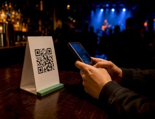
- Musicians and performers. QR code on a table tent at shows, plus the link in the bio. Presets: $5, $10, $25. Sample copy: “Loved the set? Tips go directly to gas money and studio time.”
- Freelancers and consultants. Add the link to your invoice thank-you page or email footer after a project wraps. Presets: $10, $25, $50. Sample copy: “If this project went smoothly, a tip is always appreciated (and never expected).”
- Small business owners. QR code at the register or on a receipt. Presets: $1, $3, $5. Sample copy: “Service was great? Skip the change, send a tip instead.”
Seasonal and cause-driven variants perform well too. A “Thank You 2026” page during December, a disaster-relief matching push, or a “help me upgrade my mic” fundraising goal with a visible progress bar all give tippers a specific reason tied to a specific moment. Developer-facing examples follow the same logic in code: Moneydevkit’s tip-jar scaffold shows preset amounts plus a custom field as the minimum viable structure, whether you’re building it yourself or picking a no-code tool that already does it.
For freelancers specifically, pairing a personalized link with a set of tested custom tip amounts tends to outperform a single generic “buy me a coffee” button, because the presets do the thinking for the tipper instead of asking them to type in a number.
How Do You Set Up a Tip Page Step by Step?
Building a tip page isn’t a design project. It’s closer to filling out a short form correctly. Here’s the order that avoids rework:
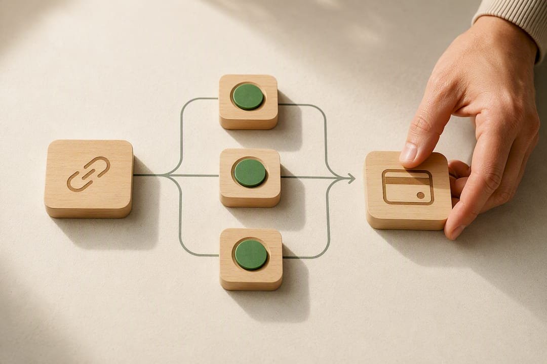
- Pick your link or platform. Choose a short, memorable URL or a dedicated tipping platform rather than a generic form builder. A personalized tip link is easier to say out loud on a livestream than a long checkout URL.
- Generate your QR code. Most link-based tools generate one automatically. Save it for print materials and stream overlays.
- Turn on wallet payments. Enable Apple Pay and Google Pay before anything else. These are the two options mobile visitors reach for first.
- Add card payments as backup. Not everyone has a wallet set up. Card checkout should still be one tap away.
- Connect your payout account. Link your bank account and confirm the payout schedule so you know when money actually lands.
- Set three presets plus a custom field. Round numbers, low to high, with room to type a different amount.
- Add a photo and a short bio. Fifty words or less. A face and a sentence build more trust than a paragraph.
- Write your thank-you flow. Decide what happens right after payment: a message, a video, a discount code.
- Test the entire flow yourself. Send a real $1 tip from your own phone.
- Test it on someone else’s device. Ask a friend to try it on a different phone and browser before you announce it publicly.
Pro Tip: Test your tip page on a phone with a cracked screen protector or an older device if you can borrow one. Layout problems that never show up on your new phone often surface immediately on someone else’s.
Once the flow works twice, in two different hands, it’s ready to publish.
Which Payment Options Actually Convert Best?
Wallet payments win on mobile, and mobile is where most tips happen. Apple Pay and Google Pay let someone confirm a payment with a face scan or fingerprint instead of typing a 16-digit card number on a phone keyboard, which is exactly the kind of friction that kills conversion at the last step.
Card checkout still matters as a fallback, but it comes with trade-offs worth knowing upfront:
- Processing fees apply to every transaction, typically taken as a small percentage plus a flat amount, regardless of which payment method the tipper chooses.
- Payout timing varies by platform — some deposit within a day or two, others take longer, so check this before you promise fans anything about turnaround.
- Wording changes perception. “Tip” reads as casual and expected in creator culture; “donation” reads more formal and charitable. Match the word to your content, not the other way around.
Whatever platform you choose, the goal is the same: get the tipper from “I want to give this person money” to “payment confirmed” in as few taps as possible, ideally without leaving the page for a new checkout screen.
What UX Rules Actually Improve Completion Rates?
Tip pages lose money in the last five seconds, not the first five. The design choices that matter most all target that final stretch between intent and completion.
- Follow the Three-Tap Rule. A tipper should be able to land on your page, pick an amount, and confirm payment in three taps or fewer. Every extra screen is a chance for someone to close the tab.
- Keep buttons thumb-sized. Mobile tap targets need real space around them; a cramped row of tiny buttons causes mis-taps and abandonment, according to tip-screen UX guidance.
- Stick to three presets. More options create decision fatigue. Anchor the highest one slightly above what you expect most people to choose; it nudges the average up without pressuring anyone.
- Show a visible “No Tip” or “Maybe Later” option. Counterintuitive, but confirmed by the same UX research: giving people an easy out builds enough trust that more people opt in.
- Keep your bio under 50 words. One sentence about who you are, one about what the tip supports.
- Check color contrast. Light gray text on a white button looks clean on a designer’s laptop and disappears on a phone in direct sunlight.
Pro Tip: Where possible, keep the whole payment flow inline instead of redirecting to a new page. Native wallet popups that complete without a page reload cut abandonment noticeably compared to a full checkout redirect.
Copy-Ready Presets and Microcopy You Can Paste In
Different creator tiers call for different anchor points. Here are three preset sets built around that idea, plus label wording you can use as-is.
- Casual creator (blogs, personal projects): $2 / $5 / $10, labeled “Buy me a snack,” “Cover my hosting,” “You’re the best.”
- Professional freelancer: $10 / $25 / $50, labeled “Quick thanks,” “Really appreciated,” “Above and beyond.”
- Livestream anchor: $1 / $5 / $20, labeled “Wave,” “Shoutout,” “VIP mention.”
Thank-you copy should stay under 50 words: “Got it. Thank you so much. This genuinely helps me keep making this stuff. If you want a personal shoutout next stream, drop your name in the note field.”
One accessibility note worth building in from day one: label currency clearly (write “$10” rather than a bare number) so screen readers announce it correctly, and avoid replacing dollar amounts with symbols or icons alone.
Where Should You Place and Promote Your Tip Link?
Placement decides whether a tip page ever gets seen, and promotion decides whether it gets seen without becoming annoying. Core placements to cover first:
- Bio or link-in-bio page, always near the top
- Website footer, on every page, not just the homepage
- Email signature or a P.S. line in newsletters
- Podcast shownotes, mentioned once per episode
- QR code signage at live events or on printed materials
For promotion, soft asks outperform hard sells. Mention the tip link once when it’s relevant, occasionally show a “thank you” feed of recent supporters to prove the system works, and refresh your presets or microcopy every few months so regular visitors don’t tune it out. Track three numbers from the start: link clicks, completed tips as a percentage of clicks, and average tip amount. Those three tell you whether the problem is visibility, friction, or pricing.
What Should You Expect When You Set Up a Tip Page With Tipper?
Tipper is built around one idea: a tipper shouldn’t need an account to send money, and a creator shouldn’t lose a cut of every dollar to platform fees beyond standard payment processing. The setup mirrors the checklist above almost exactly. Pick a personalized link, turn on Apple Pay and Google Pay, set your presets, connect payouts, and you’re generally live within minutes rather than days.
A tip page works best when it asks for almost nothing from the person paying: no login, no app download, no new password to remember. The fewer decisions between “I want to tip” and “paid,” the more tips actually happen.
Creators keep full control over branding, thank-you messages, and payout timing, and the platform supports text, photo, or video thank-you notes so the relationship doesn’t end at the transaction. That last part matters more than it sounds. A tip is often the only direct signal a creator gets that someone was paying attention, and a real thank-you closes that loop.
Our Take: Most Tip Page Advice Optimizes the Wrong Step
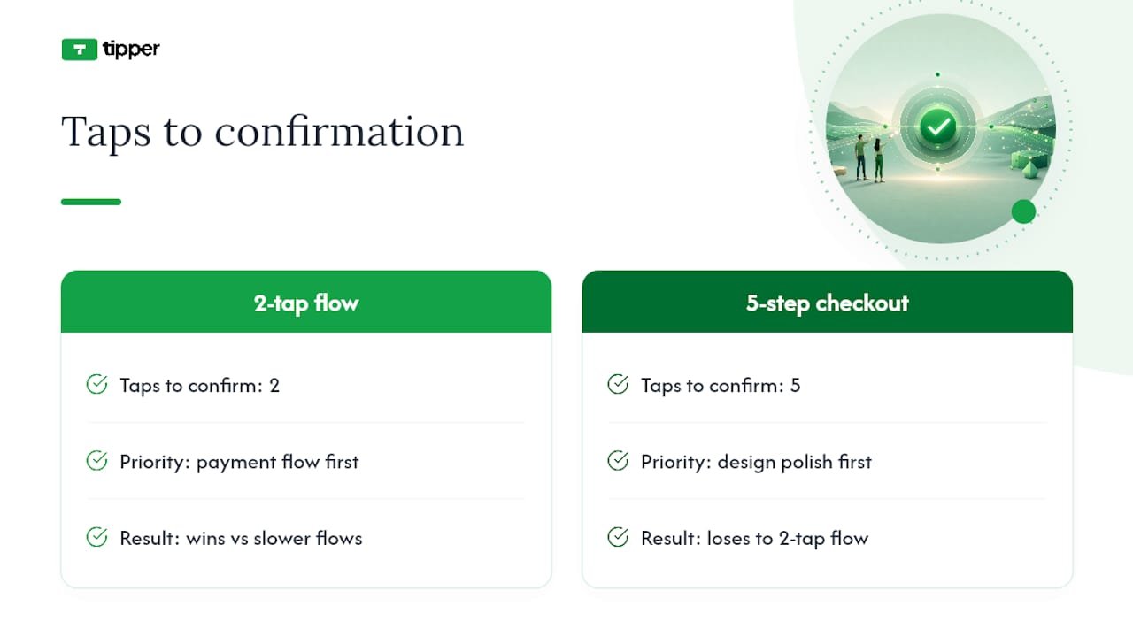
Most guides on this topic obsess over design polish, fonts, colors, animated confirmation screens, and mostly ignore the one variable that actually moves the needle: how many taps stand between intent and confirmation. A beautifully designed tip page with a five-step checkout will lose to an ugly one that completes in two taps, every time.
The conventional advice to “give tippers lots of options” is backwards, too. Three presets outperform six, because every additional choice is a moment where someone can talk themselves out of tipping. The research on tip-menu anchoring backs this up: a small, well-anchored set of options raises average tip size without adding friction.
If you take one thing from this article, prioritize the payment flow over the visual theme. Get wallet payments working first, get the three-tap flow tested on a real phone second, and treat font choices and color palettes as the very last thing you touch.
— Tipper
Ready to Launch Your Own Tip Page?
Some platforms get a creator from zero to a working tip page quickly by requiring no account on the sender’s side and no subscription fee for the creator. You keep control over your payout schedule, your presets, and how you thank the people who support you, whether that’s a text note or a short video.
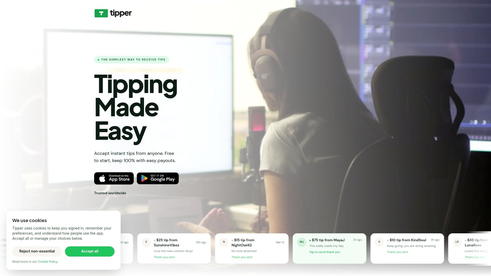
Creators often choose platforms for reasons like speed to launch, payout control, and support for mobile wallet payments so tippers can pay in one tap. If you’re weighing this against a plugin-based setup like a WordPress payment plugin or an embeddable widget from a donation processor like Donorbox, the trade-off usually comes down to how much setup time you want to spend versus how fast you want to be live.
Set up your personalized tip link today and test your first live flow within the hour.
Sources
- IndieWeb — Tip
- Moneydevkit — Tip-jar example
- Tip Screen UX Design: Best Practices for 2026 — OneWebCare
- WordPress plugin: Stripe Payments
- Donorbox
FAQ
Can You Give Me an Example of a Tip?
A common example is a podcast host adding a link in their shownotes with preset amounts of $2, $5, and $10, alongside a line like “Enjoyed this episode? A quick tip helps cover editing costs.”
What Are Some Clever Ideas for a Tip Jar?
Tie the ask to something specific and visible, like a progress bar toward new equipment, a QR code on a physical table tent at live shows, or a rotating seasonal theme like a “Thank You 2026” page during the holidays.
How Do I Create an Online Tip Jar?
Pick a personalized link or platform, turn on Apple Pay and Google Pay, set three preset amounts with a custom field, connect your payout account, and test the full flow on your own phone before sharing it publicly.
Is a 20% Tip a Good Tip?
That figure applies to service industries like restaurants and delivery, not creator tip pages, where there’s no fixed percentage; tips instead run on flat preset amounts, commonly ranging from $1 to $50 depending on the platform and content type.



Leave A Comment