
The single rule that matters most: put your tip link or QR code as close as possible to the moment your audience feels grateful, and make sure it’s visible without scrolling or clicking. That means the top two lines of a YouTube description, the primary button in an email, or the first thing someone sees on your profile. Tools like some tipping platforms make this fast to set up since the link works without the sender needing an account.
TL;DR:
- Placing your tip link in the top two lines of a YouTube description or email above the fold significantly increases visibility and action.
- On social bios, keep your tip link at the top of your link-in-bio page or direct it to a dedicated campaign, avoiding footer placement.
- For printed QR codes, place them near the activity they relate to, ensure they are large enough for the preferred scan distance, and test under lighting conditions.
- Tracking with UTM parameters and running small tests helps determine the most effective placement and wording for your tips across channels.
- Use consistent, benefit-focused CTA wording and visual style to improve recognition and repeated support from your audience without appearing pushy.
Table of Contents
- 1. Best online placements for websites and social bios
- 2. Video placements that make tipping frictionless
- 3. Email and newsletter placement without hurting deliverability
- 4. Physical and in-person QR code placement
- 5. CTA wording, visual hierarchy, and repetition rules
- 6. Test, measure, and iterate on your placements
- Practical notes from running a tipping platform
- Setting up your tip link and placement presets
- Sources
- FAQ
1. Best online placements for websites and social bios
Your website’s hero section is prime real estate. If someone lands on your homepage or portfolio page, the tip link or button should sit near your headline, not buried three scrolls down. This follows a basic usability idea called the proximity principle: elements placed close together are read as related. So, a tip button next to your name or your latest work signals “this is how you support what you just saw.”
Social bios are trickier because most platforms give you one link. On Instagram, X/Twitter, TikTok, and Facebook, that single slot has to work hard. If you only promote one thing, make it the tip link during a campaign or milestone, then swap it out as needed. If you regularly need to share multiple links, a link-in-bio landing page works, but keep the tip link at the top of that page, not the fourth item down.
Footers are fine for a secondary, low-pressure mention, the kind of thing someone finds if they’re already looking. They should never be the only place your tip link lives. A link nobody sees because it’s stuck in a footer is functionally the same as no link at all.
- Add a visible tip button or link near your website’s headline or main content.
- Use your single bio link for the tip page during key moments, or route to a landing page that keeps tipping first.
- Keep footer links as a backup, never your primary placement.
Pro Tip: Match your CTA wording across your site and bio so returning visitors recognize the button instantly.
2. Video placements that make tipping frictionless
Video is where a lot of tipping decisions actually happen, and where placement mistakes are easiest to make. YouTube’s own guidance recommends putting important links in the description and checking how that description displays on different devices, since mobile viewers only see the top couple of lines before hitting “more.” Treat those top two lines like above-the-fold space: if your tip link is on line five, most viewers on phones never see it.
- Place your tip link in the top two lines of the YouTube description, then verbally mention it in the video itself.
- Pin a comment with the link, since YouTube supports pinning comments for visibility, and reference it out loud so viewers know to look.
- During livestreams, keep an on-screen overlay with the link or QR code and a pinned chat message that repeats it periodically.
- In Shorts or other short-form video, use on-screen text with your bio link, and pair a short URL next to any QR code shown.
Our step-by-step guide to YouTube tip link placement walks through description formatting and pinned comment setup in more detail.
Pro Tip: Preview your description on a phone before publishing. What looks fine on desktop often gets cut off on mobile.
3. Email and newsletter placement without hurting deliverability
For short emails, put your tip button above the fold, meaning visible without scrolling. Mailchimp’s guidance on email buttons recommends this exact approach, along with repeating the CTA later in longer emails so readers who scroll past the first mention still have a chance to act.
Use action-first copy like “Tip to support this work” rather than a vague “Click here.” The destination should be obvious before anyone clicks, and the button should lead straight to your tipping checkout, not a general homepage. Test the email across Gmail, Apple Mail, and Outlook, since button rendering varies by client.
- Place one primary tip button above the fold in every email you send.
- Repeat a second, contextual button further down in long-form newsletters.
- Add UTM parameters to your tip link so you can see which email placement actually drives completed tips.
Mailchimp notes that CTA placement determines whether subscribers notice and act, which is why buried or inconsistent buttons underperform even when the offer itself is strong.
4. Physical and in-person QR code placement
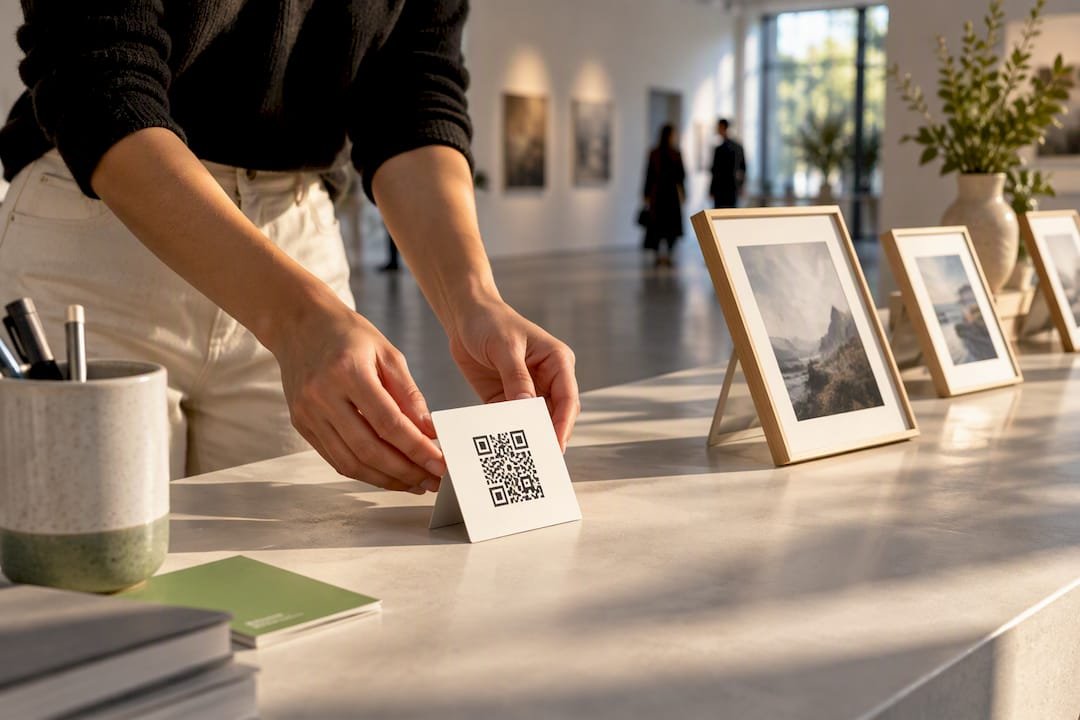
Printed QR codes fail for a simple reason: they’re placed somewhere nobody’s looking. NN/g’s QR code research recommends placing codes where users will naturally look and directly next to the activity they relate to, whether that’s a merch table, a performance area, or a checkout counter, rather than off to the side on a separate sign.
Test your printed code in the actual lighting and viewing distance before an event. Glossy finishes and direct sunlight cause glare that stops phones from scanning, a problem NN/g flags specifically in its testing recommendations. Always print a short URL alongside the code and a one-line description, like “Scan to tip the band,” so people know what they’re scanning before they commit.
- Place QR codes right next to the merch table, stage, or checkout, not on a separate flyer.
- Test prints under the event’s real lighting, and avoid glossy paper that causes glare.
- Print a short URL and one-line description next to every code.
Pro Tip: Size your QR code for the farthest expected scan distance. A code that works from three feet away often fails from across a room.
5. CTA wording, visual hierarchy, and repetition rules
Across every channel, a few rules hold steady. Keep your CTA copy benefit-focused and action-first: “Tip to support this clip” outperforms a plain “Tip me” because it reminds people what they’re supporting. Apply proximity everywhere, placing the link close to whatever content triggered the goodwill, whether that’s a video, a post, or a live performance.
Use high-contrast buttons and keep the same visual style across your site, emails, and social posts so people recognize your tip button on sight. Mailchimp’s CTA research points out that misplaced or inconsistent CTAs reduce effectiveness, while repeated, consistent CTAs improve recognition over time.
- Write CTA copy that names the benefit, not just the action.
- Place the link close to the content people already value.
- Keep button color, shape, and wording consistent across channels.
- Repeat the CTA where it fits naturally, without repeating it so often it feels pushy.
6. Test, measure, and iterate on your placements
You can’t know which placement works until you track it. Add UTM tags to your tip link so each source, bio, description, email, or QR code, reports separately, then compare click-to-tip conversion across them. Run simple A/B tests: try a hero placement one week and an inline mention the next, or swap CTA wording while keeping placement fixed.
- Tag each tip link with a UTM source so you know exactly where clicks originate.
- Test one variable at a time, either placement or CTA text, not both together.
- Run a quick checklist before publishing: the link works on mobile, checkout loads, a test tip completes, and the thank-you page displays correctly.
- Review results weekly and adjust the next placement based on what the data shows.
| Placement | What to track | Action if underperforming |
|---|---|---|
| YouTube description | Clicks from top-line link | Move link higher, pin comment |
| Email button | Click-to-tip rate above vs. below fold | Move button above the fold |
| QR code at event | Scans per hour of visibility | Reposition near main activity |
Practical notes from running a tipping platform
The clearest pattern we see is that the placements creators overthink, like custom graphics or elaborate landing pages, matter far less than simple visibility. A tip link that works without the sender needing an account, and supports popular digital payment methods at checkout, removes most of the friction already. What’s left is making sure people actually see it.
We consistently point creators toward the same short list: top two lines of a YouTube description, one clear button in a newsletter, and a quick link on a Facebook profile. None of these require design skill. Our advice to anyone starting out: change one placement per week and watch what happens before changing another.
— Tipper
Setting up your tip link and placement presets
Payment goes through Apple Pay, Google Pay, or a card, and every tip can carry a thank-you note back to the sender.
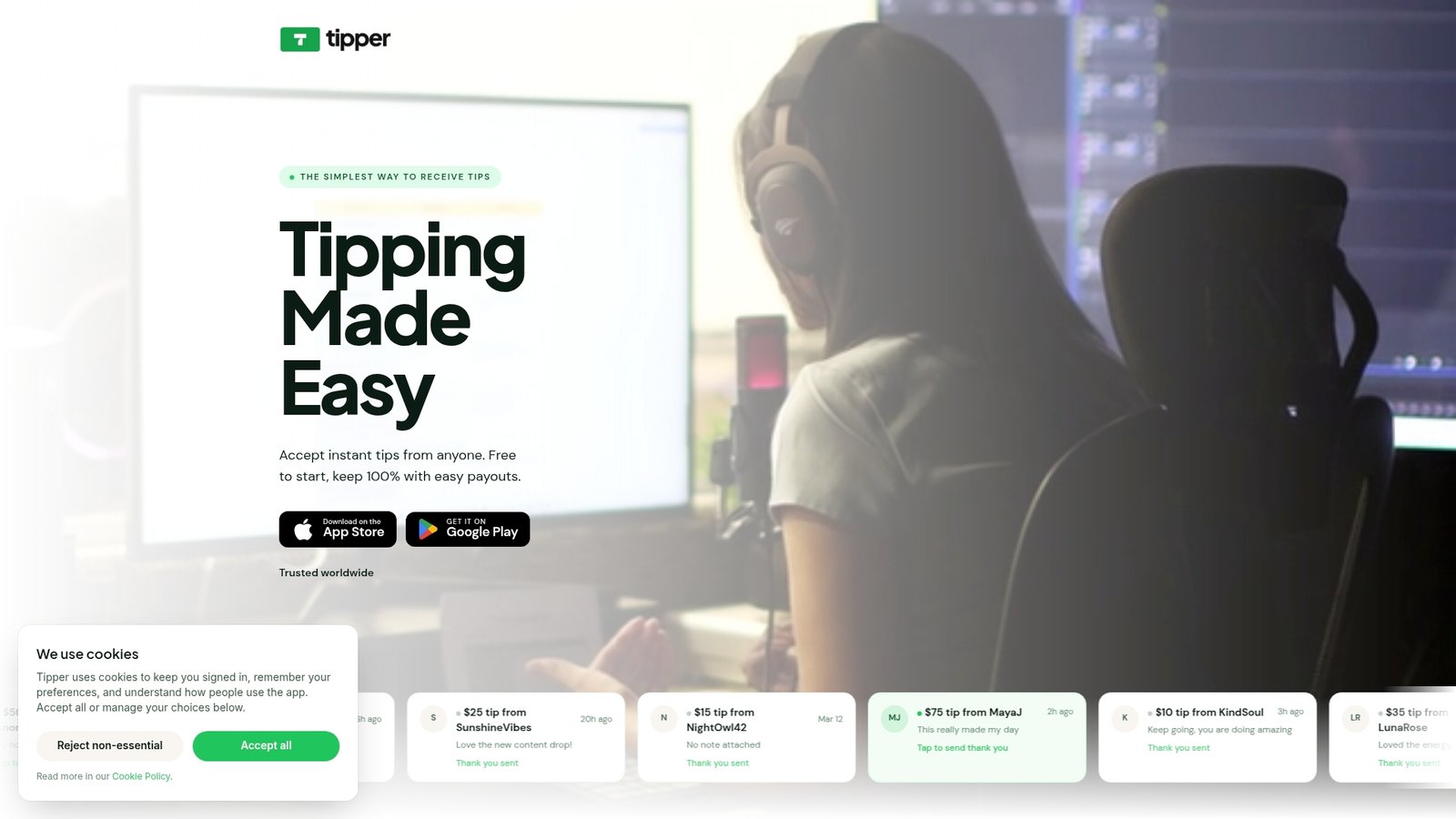
Once your link exists, the placements in this guide become a short checklist rather than a redesign project. Try the YouTube top-line preset first since it costs nothing but a few seconds of editing your description, then add a newsletter button, then a quick link on your Facebook profile.
- Create a personalized tip link with no signup required for supporters.
- Apply the YouTube top-line, newsletter button, and social bio presets one at a time.
- Track which placement brings in the most support before adding new ones.
Start by creating your tip link on Tipper and placing it in the spot your audience already looks first.
Sources
For deeper detail, NN/g’s QR code usability guidelines cover print testing and placement research. YouTube’s help documentation explains how descriptions render across devices. Mailchimp’s guide to email buttons covers CTA placement and testing, and our own creator tip link strategy guide walks through setup and presets in more detail. For a payments-industry perspective on links versus invoices, Audome’s comparison is worth a look.
- 13 QR-Code Usability Guidelines – NN/g
- Tips for video descriptions – YouTube Help
- What Are Email Buttons and How to Use Them | Mailchimp
FAQ
Where should I put my tip link on YouTube?
Put it in the top two lines of your video description so it’s visible on mobile without needing to tap “more,” and pin a comment with the same link. YouTube’s own guidance confirms that description display varies by device, which is why the top lines matter most.
How many times should I repeat my tip link in an email?
For a short email, one button above the fold is enough. For longer newsletters, repeat the CTA once more further down, a pattern Mailchimp recommends to catch readers who scroll past the first mention.
Do QR codes need to be a certain size to work?
Yes, size should match the expected scan distance: a code meant to be scanned from across a room needs to be larger than one placed on a checkout counter. NN/g’s testing guidance recommends testing prints under real lighting and viewing conditions before an event.
Is it better to use a single bio link or a link-in-bio page?
A single direct link works well if tipping is your main call to action at the time. If you need to share several links regularly, a link-in-bio landing page works too, as long as the tip link stays at the top rather than getting lost among other items.
How do I know which tip link placement is actually working?
Add a UTM tag to each version of your link, one for your bio, one for your description, one for email, so you can compare clicks and completed tips by source. Review the results weekly and adjust placements based on what the numbers show rather than guessing.


Leave A Comment